A responsive table jQuery plugin with respontable.js is automatically converts a table into a Bootstrap based dropdown interface. it will work responsive screen (max-width:768px) with auto adjust like : drop-down, two columns, fixed position. its also work with bootstrap table.
The table is typical in web designing to handle; even in bootstrap design development, it’s tough to view when the screen size is small as the reference and related columns and rows.
In the modern world of responsive web designing, tables can often confuse, creating a problem for designers due to their row and column-based layout. Responsive design is an extension for DataTables that resolves that problem by optimizing the table’s layout for different screen resolutions using the dynamic insertion and deletion of columns from the table.
In the case of Bootstrap, it can handle tables with the help of proper framework usage. Aggregation of the massive amount of data to present data properly and orderly using Bootstrap for Tables. Bootstrap tables help to manipulate the table styles and help to enable excellent responsiveness.
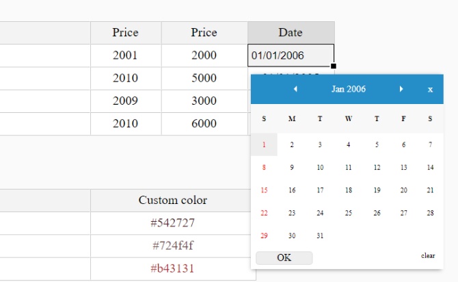
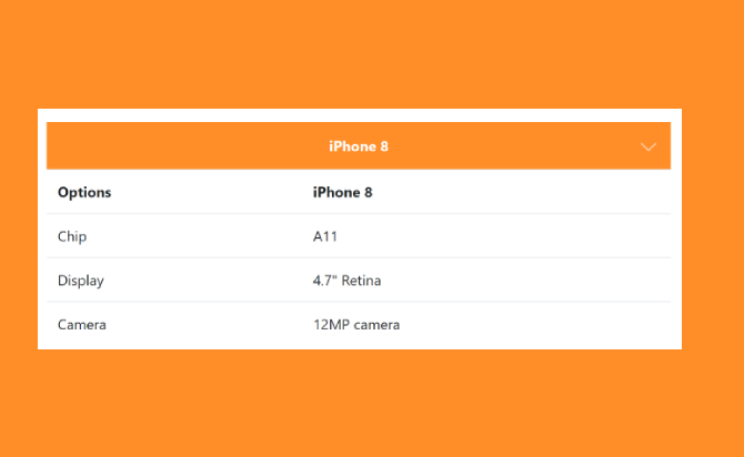
Third-party widgets like calendars, organized data, and date pickers extensively use <table> tag to display well-framed structure; usually, Bootstrap helps build these kinds of elements. All table styles are not inherited in Bootstrap, meaning any nested tables can be styled independently from the parent using a CSS stylesheet. But JQuery helps make this structure more dynamic to filter the data and display only relevant values that correspond to that particular row and column. In the given demo, you can see that when the screen size is below 768, the <th> corresponding to the relevant column data is retrieved using the select option, whereas, in standard desktop view, it’s shown as a perfect table. This JQuery usage reduces the user’s clumsiness and improves user-friendliness, and enhances the user experience.
Table of Contents
Options :
- X Scroll ( .table-xscroll )
- 2. Dropdown ( .table-dropdown )
- 3. Two Columns ( .table-twocol )
- 4. XY Swap ( .table-xyswap )
- 5. Fixed 1st Column ( .table-firstcol )
How to used:
First, include jQuery library and second the ‘respontable.css’ and ‘respontable.jquery.min.js’ files in your webpage.
<link rel="stylesheet" href="respontable.css" type="text/css"/>
<script src="jquery.min.js"></script>
<script src="respontable.jquery.min.js"></script>
Second, insert the responstable CSS class you want in your table, that’s it !
<table class="table table-dropdown">
   <tr>
       <th>Options</th>
       ...
       ...
       <td>6.1" OLED</td>
   </tr>
</table>
Finally, initial respontable.js with a trigger breakpoint (such as 768) in your webpage.
<script> respontable(768); </script>
Done
Thanks for make jQuery plugin is developed by Sam Lau For more Helpfull for users, please check the demo page or visit the official website.