Bootstrap Modal Extended – Modal with multiple placement modes, dynamic loading of content, and more. The plugin uses enhanced styling specific for Bootstrap versions 5.x, 4.x or 3.x, supported and has been significantly extended for Bootstrap 3.0.x and includes many new features. This plugin was inspired by BootstrapModals for Bootstrap 2.0.4, and has been significantly improved for Bootstrap 3.1.x and includes many additional features.
Table of Contents
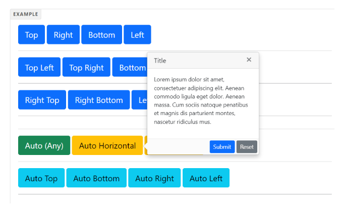
Key Features:
- Modal style popovers.
- Smart auto position.
- Supports more placements.
- Supports Bootstrap contextual color styles: default, primary, info, success, danger, and warning.
- Close button.
- Custom trigger events: hover, click and focus.
- Compatible with Bootstrap 3/4/5.
How to use it:
To add this plugin, jQuery library and Bootstrap framework installed in your web project.
<link href="/path/to/bootstrap.min.css" rel="stylesheet">
<script src="/path/to/jquery.min.js"></script>
<script src="/path/to/bootstrap.min.js"></script>
Add the Bootstrap Popover X plugin’s files in the page.
<link href="bootstrap-popover-x.css" rel="stylesheet">
<script src="bootstrap-popover-x.js"></script>
Create the Bootstrap Popover X content as follow:
<div id="myPopover1" class="popover popover-x popover-default">
<div class="arrow"></div>
<div class="popover-header popover-title"><button class="close" data-dismiss="popover-x">×</button>Title</div>
<div class="popover-body popover-content">
<p>Lorem ipsum dolor sit amet, consectetuer adipiscing elit. Aenean commodo ligula eget dolor. Aenean massa. Cum sociis natoque penatibus et magnis dis parturient montes, nascetur ridiculus mus.</p>
</div>
<div class="popover-footer">
<button type="submit" class="btn btn-sm btn-primary">Submit</button><button type="reset" class="btn btn-sm btn-secondary">Reset</button>
</div>
</div>
Create a trigger button to toggle the popover.
<button type="button" class="btn btn-primary btn-lg" data-toggle="popover-x" data-target="#myPopover1" data-placement="top">Top</button>
Done
Thanks for make jQuery plugin is developed by For more Helpfull for users, please check the demo page or visit the official website.