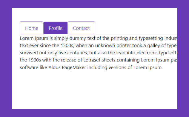
A Free jQuery Plugins with WFAccordion is accordion control with keyboard. The WFAccordion is a jQuery-based plugin that allows for the creation of accessible accordion components. It offers keyboard navigation and supports multiple panels, each with its own header and content. The plugin is highly customizable and can be used to enhance the accessibility of websites and applications.
Table of Contents
How It Works:
- Enhance triggers and panels with ARIA attributes:
aria-expanded,aria-hidden,aria-disabled. - Create unique IDs for use in ARIA relationships:
aria-controls,aria-labelledby. - Create ARIA relationships between headers and panels.
- Update ARIA states on click/tap.
- Follows the best practices laid out in WAI-ARIA Authoring Practices 1.2 for Accordions.
- Enhance a given placeholder element with a for better keyboard support.
- Compatible with both jQuery and Vanilla JavaScript.
Keyboard Support:
- Open/close accordion panels using up / down arrows as well as Ctrl + Page Up / Page Down keys
- Focus the first accordion using End key.
- Focus the last accordion using Home key.
How To Use :
To get started, download and import the wfAccordion.
<!-- jQuery -->
<script src="/path/to/jquery.min.js"></script>
<script src="/path/to/wf.accordion.js"></script>
<!-- Vanilla JavaScript -->
<script src="/dist/wf.accordion.min.js" defer></script>
// ES Module
import 'webfactory-accordion/dist/wf.accordion.min';
Build the HTML structure for the accordion.
<div class="wf-accordion-group js-accordion-group">
<div class="wf-accordion js-accordion">
<div class="wf-accordion__header js-accordion__header">
<h3 class="wf-accordion__trigger js-accordion__trigger">This is an accordion</h3>
</div>
<div class="wf-accordion__panel js-accordion__panel">
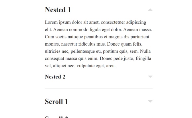
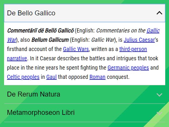
<p>Accordions are a common design pattern in web design. They are often used to hide large chunks of content from the user intially. The aim is to provide a general overview of the content to the user, so that he can decide which part of it is interesting to him and can expand the content via interaction.</p>
</div>
</div>
<div class="wf-accordion js-accordion" data-wf-accordion-expanded="">
<div class="wf-accordion__header js-accordion__header">
<h3 class="wf-accordion__trigger js-accordion__trigger">This accordion is expanded initially</h3>
</div>
<div class="wf-accordion__panel js-accordion__panel">
<p>Add "data-wf-accordion-expanded" to the accordion's root element to expand its panel initially.</p>
</div>
</div>
<div class="wf-accordion js-accordion" data-wf-accordion-disabled="">
<div class="wf-accordion__header js-accordion__header">
<h3 class="wf-accordion__trigger js-accordion__trigger">This accordion has been disabled by adding "data-wf-accordion-disabled" to its root element</h3>
</div>
<div class="wf-accordion__panel js-accordion__panel">
<p>Add "data-wf-accordion-disabled" to the accordion's root element to disable it.</p>
</div>
</div>
<div class="wf-accordion js-accordion">
<div class="wf-accordion__header js-accordion__header">
<h3 class="wf-accordion__trigger js-accordion__trigger">
<span class="some-important-modifier-class">This accordion's trigger element has <em>nested</em> <strong>elements</strong> (e.g. a <code>strong</code> or <code>span</code>)</span>
</h3>
</div>
<div class="wf-accordion__panel js-accordion__panel">
<p>You can use nested elements inside the element with <code>.js-accordion__trigger</code>.</p>
</div>
</div>
<div class="wf-accordion js-accordion">
<div class="wf-accordion__header js-accordion__header">
<div class="wf-accordion__trigger js-accordion__trigger">
<h3>This accordion's trigger element has a nested heading that will become the parent element of the button.</h3>
</div>
</div>
<div class="wf-accordion__panel js-accordion__panel">
<p>To result in valid HTML, the final DOM needs to avoid nesting block-level elements in buttons.</p>
</div>
</div>
</div>
Initialize the accordion.
$(function(){
  // jQuery Only
  $('.js-accordion-group').wfAccordion();
});
Apply your own CSS styles to the accordion.
/**
* Accordion example styles
*/

.wf-accordion-group {
  margin-top: 15px;
}

/* All elements succeeding an accordion group use margin-top to create white space */
.wf-accordion-group+* {
  margin-top: 30px;
}

/* All accordions have borders… */
.wf-accordion {
  border-top: 1px solid #929292;
  border-bottom: 1px solid #929292;
}

/* …unless they directly succeed another accordion, in which case we reset the top-border
to avoid duplicate white space */
.wf-accordion+.wf-accordion {
  border-top-width: 0;
}

.wf-accordion__header {
  color: #616161;
}

/* Please note: The trigger element is a <button> create via JS. To achieve consistent aesthetics,
 the native button styles have to be resetted here */
.wf-accordion__trigger {
  /* baseline resets */
  background: transparent;
  border-width: 0;
  border-radius: 0;
  box-sizing: border-box;
  cursor: pointer;
  display: inline-block;
  font-size: inherit;
  letter-spacing: inherit;
  line-height: inherit;
  margin: 0;
  padding: 0;
  text-align: left;
  text-decoration: none;
  /* end of baseline resets */

  /* additional styles for the demo */
  display: block;
  font-family: Arial, sans-serif;
  padding: 10px 1.25em 10px 8px;
  position: relative;
  width: 100%;
}

.wf-accordion__trigger::after {
  content: '';
  border: solid #929292;
  border-width: 0 2px 2px 0;
  height: 0.5em;
  position: absolute;
  right: 10px;
  top: 50%;
  transform: translateY(-60%) rotate(45deg);
  width: 0.5em;
}

.wf-accordion__trigger[aria-disabled=true] {
  cursor: not-allowed;
  opacity: 0.5;
}

.wf-accordion__trigger[aria-expanded=true]::after {
  transform: translateY(-30%) rotate(-135deg);
}

.wf-accordion__trigger:hover,
.wf-accordion__trigger:focus {
  background: #f5f5f5;
  color: #161616;
}

.wf-accordion__trigger:hover::after,
.wf-accordion__trigger:focus::after {
  border-color: #161616;
}

.wf-accordion__panel {
  background-color: #fff;
  padding: 10px 8px;
}

.wf-accordion__panel[aria-hidden=true] {
  display: none;
}
Done
Thanks for make jQuery plugin is developed by webfactory For more Helpfull for users, please check the demo page or visit the official website.